The Net Benefits of Haven for Hope

Haven for Hope began operations in 2010 with the mission “to offer a place of hope and new beginnings by providing, coordinating, and delivering an efficient system of care for people experiencing homelessness in San Antonio.” Haven for Hope has become a model of excellence for how to establish and operate a facility to effectively and efficiently serve those who are experiencing homelessness. With its 75 partners and numerous volunteers,[1] Haven for Hope has provided care for 52,108[2] people who have experienced homelessness with profound impacts on their lives and the broader San Antonio and Bexar County community. For example, after one year upon graduating from Haven for Hope, 92.42 percent of those who exited to housing in 2023 remained in housing for at least twelve months through 2024. The retention rate for all of those who exited Haven for Hope and remained out of homelessness for at least twelve months, including those who exited to another facility for higher care, to stay with family or friends, to a transitional housing facility, and including all those who exited without completing an exit interview was 75.01 percent as of 2023. In part, this high housing retention rate is the result of the fact that 683 clients of Haven for Hope in 2024 found employment.[3]

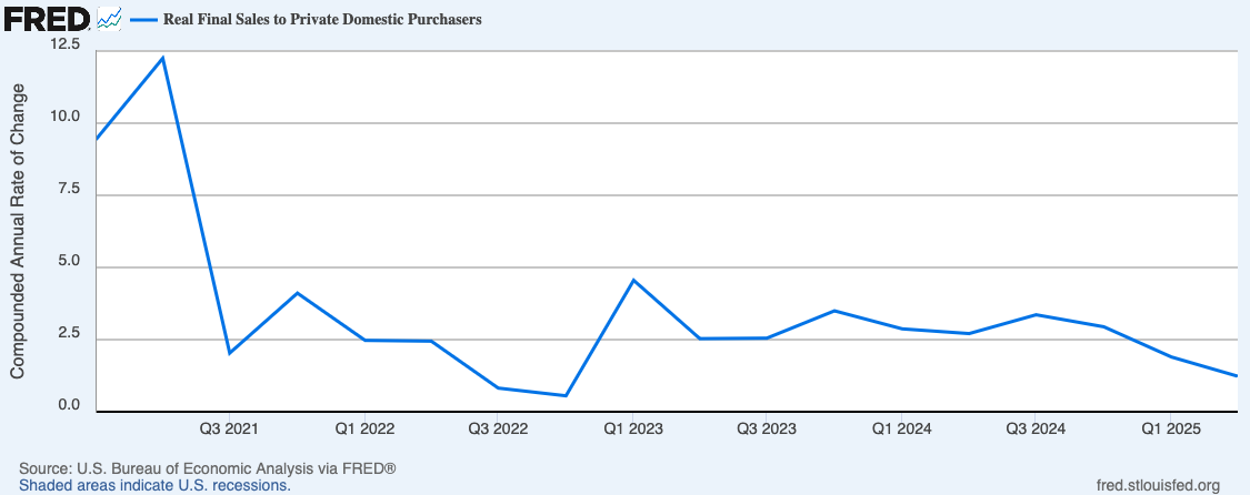
I recently completed a study to measure the net benefits of the services provided by Haven for Hope to the community from 2007 through 2024.[4] The value of the benefits and total expenses measured in the study are provided in the following table. Haven for Hope has provided net benefits to the community of $12.7 billion. In other words, for each dollar spent to create and operate Haven for Hope, the community has received $42 in benefits.

While the scope of this study only analyzed the benefits through 2024, it is also worth noting that Haven for Hope has continued to innovate and push its model of excellence in serving persons experiencing homelessness and the broader San Antonio community. This is exemplified through its contributions to the community’s response to the COVID-19 pandemic.  While much of the community was in lockdown and experiencing unprecedented economic stress due to the pandemic, Haven for Hope made numerous adaptations to their operations in order to keep safely providing their services. This included the creation and implementation of Operation Hope Away from Haven focused on serving their highest-risk clients who had become exposed to COVID-19 and to maintain social distancing.

As these results indicate, Haven for Hope’s impact on the San Antonio community has been profound, especially for those they serve, but their overwhelmingly positive impacts extend well into the broader community. By providing a path to a new beginning for those who are experiencing homelessness, Haven for Hope’s work towards the achievement of their mission contributes substantially to both the quality of life of those they serve and all who live in San Antonio and Bexar County. By helping those persons experiencing homelessness find permanent housing and providing them with the care, guidance, and skills each individual needs to begin a successful journey to self-sufficiency, these benefits will be felt throughout their lifetimes and will also serve as a catalyst for economic development well into the future.

In the full report, the methodologies used in the analysis are documented and more detailed results are provided. If you wish to read the report, you can find it at this link.


[1] Source: https://www.havenforhope.org/our-partners/

[2] Data provided by Haven for Hope.

[3] Data provided by Haven for Hope.

[4] While operations did not begin until 2010, expenses to establish Haven for Hope began in 2007, so while the benefits were measured from 2010 through 2024, the expenses were calculated going back to 2007.

The Contrast of Employment Growth in San Antonio

The Federal Reserve Bank of Dallas recently posted an interesting article in which it discussed the slowing growth in Texas as employment growth slowed in June. However, this has not been the case in the San Antonio-New Braunfels metropolitan area. As shown in the following chart, employment growth in San Antonio picked up pace in May and June in contrast to the state economy and the other major metropolitan economies in Texas. Employment growth in San Antonio was faster than all of the other major metropolitan economies but just slightly lower than the growth in the state. Employment across the state grew 1.64% while employment grew 1.59% in San Antonio in June (Table 1). While growth in San Antonio is relatively stronger than the other major metropolitan economies, it is still below the long-term average growth rate of 2.30%.

The figures in Table 2 show the growth rates by industry in San Antonio. The growth rates highlighted in green show those growth rates across each industry that accelerated during this time period. This shows that the employment growth in San Antonio over the three months from April through June have been driven by construction, mining, and natural resources; manufacturing; trade, transportation, and utilities; financial activities; education and health services; and leisure and hospitality. Construction grew on average 2.32% over this six-month period with the biggest acceleration coming in May and June, while mining and natural resources declined -0.45% over this period. For those who live in San Antonio, it is probably no surprise that construction drove the growth in this sector. Growth in education and health services was driven by growth in health services with an average monthly expansion of 4.09% over this period. Employment in private education health services shrank -1.88% on average each month. Keep in mind that this is just private education health services, as the public schools are captured in local government.

While the state and metropolitan economies are still expanding as measured by employment growth, their growth is slowing. Maybe San Antonio continues to lead the pack in growth, but I do expect overall growth to continue to be anemic and likely even slow more across the state and the U.S.

Steve

U.S. Economic Growth May Actually be Slowing

In my speeches, classes, or whenever I am asked about the state of the economy, I will frequently stress the need to look behind the headline economic numbers to get a better sense of what is happening in the economy and where it might be headed. This is arguably more important during these extraordinarily uncertain economic times, as illustrated by the current release of the U.S. real gross domestic product (GDP) figures.

U.S. real gross domestic product grew by 3.0% in the second quarter of this year. This follows a decline of 0.5% in the first quarter (U.S. Bureau of Economic Analysis). While the growth in the second quarter seems to indicate the economy has rebounded from the decline in the first quarter, it is necessary to look a bit deeper in the figures because these big swings in growth were driven by historically large changes in net exports. More specifically, it was large changes in imports as business substantially increased their imports in the first quarter to get ahead of the tariffs and then pulled back in the second quarter. This is shown in the following chart of the contribution in percent change in real gross domestic product attributed to net exports. The data in the chart go back to the fourth quarter of 1947 covering all data available, The contribution in percent change in real gross domestic product derived from net exports was -4.61 in the the first quarter of this year and 4.99 in the second quarter. It is clear from the graph that these are the largest swings in the contribution of net exports to the change in GDP in history. Net exports are the value of exports minus the value of imports, so the negative contribution of net exports in the first quarter is due to the very large increase in imports and the reverse of that in the second quarter.

To get a clearer picture of how the economy grew over the first two quarters of 2025, we need to look at the change in real final sales to private domestic purchasers calculated as “the sum of consumer spending and gross private fixed investment [i.e., capital expenditures]” (U.S. Bureau of Economic Analysis). This removes the volatile components of GDP – net exports and inventories – and provides a “cleaner” measure of private domestic demand with a focus on domestic demand since net exports are removed.

The following graph shows the growth in real final sales to private domestic purchasers for each quarter since the first quarter of 2021. The picture of economic growth looks vastly different by this measure, since it has declined in each quarter since the third quarter of 2024. In the first quarter of 2025 real final sales to domestic purchasers grew 1.9%, but the growth rate declined to 1.2% in the second quarter (U.S. Bureau of Economic Analysis).

Contrary to what the headline GDP figures show for this quarter, trends in private domestic demand indicate U.S. economic growth may actually be slowing.

2023 San Antonio Economic Forecast

I recently gave a speech to the Alamo Chapter of the Government Finance Officers Association of Texas in which I shared my thoughts on the state of the economy and my forecast for the San Antonio economy in 2023. In short, I am about as confident as one can be that we will have a recession in 2023. The biggest uncertainty about the forecast concerns how long the recession will last and how deep it will be. At this point my thought is that the economy will not experience a big decline, and the decline will be for a relatively brief period of time.

Although I am by no means the only economist who is predicting a recession, it seems somewhat odd calling for a recession at this point, since employment growth is strong, the unemployment rate is low, and gross domestic product is still growing. However, there are some key indicators that are pointing toward a recession. One of the main indicators is the yield curve, which has not been this persistently inverted in forty years. Employment growth, while still strong, is declining, and the unemployment rate appears to have hit its bottom. Consumer spending is starting to slow as the large increase in savings due to the various pandemic stimulus programs has been depleted. Delinquency rates on credit cards are also rising indicating consumers are under some financial stress. Private domestic investment is starting to decline, as it has done before every recession since 1980. The housing market has started to soften, as have other lending activities. These trends are what we expect to see as the Federal Reserve has raised their Federal Funds Rate a large amount in a short period of time to try to get inflation under control with the ultimate goal of also keeping the economy on its growth path. In other words, it is trying to execute a “soft landing.” In my reading of the data going back to the recession at the beginning of the 1970s, the Federal Reserve has not been successful at executing a “soft landing,” so I am not confident that they will be successful this time. This is not meant to discredit the Federal Reserve; it is just an extraordinarily difficult task to accomplish.

Given the direction all of these indicators are pointing, I am projecting that employment growth in San Antonio will be flat to down about 1.0%, and the unemployment rate will rise to 4.5-5.0% in 2023.

San Antonio Economic Forecast 2022

The San Antonio economy has bounced back from the pandemic-induced recession quite nicely, and I believe the economy will likely continue to show growth at or slightly above its long-term trend in 2022. I project employment growth this year to be in the range of 2.2-2.7%, and the unemployment rate will continue to decline to about 3.5-4.0%. The data, trends, and potential factors that I am seeing in my crystal ball that form the basis for this forecast are discussed in the rest of this post.

After a quick rebound from the pandemic-induced recession, the San Antonio economy has moved toward its more long-term average growth rate in employment. This is somewhat against the pattern seen in the other major metropolitan economies across Texas, as they have continued to maintain historically strong growth. This is especially the case for the Austin economy. These patterns are evident in the following chart showing the year-over-year employment growth. Even though many of these areas have continued to experience such strong growth, it is clear that there is a sizable gap between them and the Austin economy.

As shown in Chart 2, the Austin economy grew 8.11% percent in December, which was still substantially larger than the second-fastest growing region – Dallas – at 5.82% and Fort Worth, the third fastest growing region at 5.02%. The San Antonio economy grew 2.87% in December – the slowest among the major metropolitan regions and below the growth rate across the state of 5.08% and the U.S. at 4.52%.

The large disparities in the growth of the Austin economy relative to San Antonio, and the other major metropolitan economies in Texas for that matter, is worth exploring, and I will have a post on that soon. For now, I want to focus on San Antonio.

Chart 3 shows the year-over-year employment growth by month across broadly-defined industries from January 2019 through December 2021 for San Antonio. As expected, the hospitality industry took the largest dive during the lock down followed by the professional services industry. These two industries have also had the largest immediate recoveries, along with the other services industry.

Chart 4 and Table 1 show the employment growth by industry from the depth of the pandemic-induced recession in April 2020 to a year later in April 2021, i.e., from trough to peak, and then for the remainder of 2021. It needs to be kept in mind that these are similar lengths of time, but it is clear from these numbers that the growth rates across almost all of the industries in San Antonio have slowed considerably. The manufacturing, construction and mining, and education and health industries have seen their growth basically stall or even turn slightly negative in the last three quarters of 2021. The one exception is the hospitality industry that not surprisingly continues to experience growth far above average.

Table 2 compares employment growth in San Antonio over its history leading up to the pandemic (Jan. 1991-Dec. 2019) to the growth rates across industries over the past year. Overall employment growth in 2021 was 2.87%, a bit above the historical average of 2.37% growth. Five of the ten industries – manufacturing; trade transportation, and utilities (TTU); professional services; hospitality; and other services – continued to grow at above average rates in 2021. Not too surprisingly, the hospitality industry continues to lead the growth with a rate of 10.87% in 2021 – far above the industry’s historical average. Only two industries experienced declining growth in 2021 – construction and mining and information. As shown in Chart 3, the declining growth in the information industry is a regression back to the mean based on recent history. Not to give away too much of the punch line for my next post, but this explains, in part, the difference in growth rates between Austin and San Antonio.

I expect these overall slowing trends in employment growth to continue through 2022 in San Antonio. Some of this is just going to be a regression back to the mean from the large growth rates as the economy recovered from the pandemic-induced recession. The structure of the San Antonio economy is an additional reason, and the potential effects of growth in the global and national economies will also play a role, as discussed below.

Similar to the pattern in the other major metropolitan Texas economies and across the state and U.S, the unemployment rate in San Antonio has steadily declined after the precipitous fall following the re-opening of the economy ending 2021 at a rate of 4.2% (see Chart 5). As shown in Chart 6, San Antonio had one of the lowest unemployment rates among the major metropolitan economies in Texas before the pandemic at 3.0%. However, San Antonio experienced one of the largest surges in its unemployment as it climbed to 14.1% in April 2020 at the depth of the recession, but as noted, unemployment has been consistently declining and is similar to the rate in Dallas (4.1%) and Fort Worth (4.2%). The unemployment rate in San Antonio is also lower than the statewide rate at 5.0%, but it is a bit higher than the U.S. unemployment rate at 3.9%. Compared to San Antonio, the unemployment rate in Austin was 0.9 percentage point lower at the end of 2021 at 3.3%. The strong economic growth since April 2020 has surely been the main driver pushing unemployment rates down, but it should be kept in mind that at least part of this decline may be due to the decline in the labor force participation rate due to the Great Resignation phenomenon. In fact, while the labor force participation has been increasing, it is still below the pre-pandemic rate of 63.4% in February 2020 for the U.S.

These structural changes in the labor market are one of the risk factors to this forecast. I can see these changes potentially having both positive and negative effects on economic growth. If the labor market adjusts to these changes fairly quickly and workers fill the jobs at higher pay and with enhanced benefits, this could serve as a boost to overall economic growth. However, if the current trend continues for an extended period of time, this could continue to exacerbate the shortages in many markets and serve to dampen economic growth. These adjustments in the labor market may be forestalled in industries where there is a relative paucity of benefits, such as paid sick leave. If the shortages causing the rapid increase in the inflation rate do not diminish in the near future, the persistent inflation at relatively high rates will also likely be a deterrent to growth in and of itself. In response to this, the Federal Reserve has sent strong signals that it will most likely be raising interest rates several times this year, which will also serve to slow the economy some. There could also be bubbles in many asset markets, such as the stock and housing markets, and if one or more of those bubbles burst, they might also cause the economy to pause a bit, even if it does not push it into a recession. The strong economic growth was, at least in part, driven by the federal government stimulus, and with that coming to an end, consumer spending is likely to move back into a more typical pattern over time causing a moderation in U.S. economic growth. It is also likely that growth in the global economy will also slow this year because of similar trends, and the economic effects of the war in Ukraine may also slow global economic growth a bit. Overall, it seems these various factors combined with the structure of the San Antonio will mean the local economy will continue to grow fairly strongly in 2022 but at a slower rate than in 2021.

Economic Impacts of the Culinary Industry in San Antonio in 2019 and 2020

I recently completed an economic impact analysis of the culinary industry in San Antonio in 2019 and 2020 for the San Antonio City of Gastronomy program. A summary of the results is shown in the following table. For the detailed results, please see the full report.

The culinary industry in San Antonio directly employed 125,770 workers and paid wages and benefits of $4,4 billion in 2019. The industry had a direct economic impact as measured by output of about $16.6 billion. The direct contributions to gross regional product (GRP) of the industry totaled $7.1 billion. However, with the impact of the COVID-19 pandemic, these impacts declined in 2020 with direct employment in the industry falling to 110,121 and wages and benefits declining to $4.0 billion. Direct economic impact shrank to about $15.8 billion, while the industry’s contribution to gross regional product fell to $6.5 billion.

When multiplier effects are included, the total employment supported by the culinary industry in San Antonio in 2019 was 227,764 workers who earned wages and benefits of almost $8.0 billion. The total economic impact on the local economy as measured by output amounted to $29.3 billion, and the industry’s contribution to GRP in 2019 was $13.4 billion. Like with the direct impacts, the total impacts declined in 2020. Total employment supported by the culinary industry declined to 208,642 jobs with incomes of $7.3 billion. The total output (i.e., economic impact) fell almost $1.5 billion to about $28.0 billion, and the total contribution to GRP declined 6.9% to $12.5 billion.

Demand for Dining in Restaurants in San Antonio and Texas

The Federal Reserve Bank of Dallas publishes a monthly report on San Antonio economic indicators, and in its most recent report, they published the following chart showing the fluctuations in restaurant reservations compared to 2019 in San Antonio and Texas. As they note, the demand for dining in restaurants fluctuates directly with the number of COVID cases, which accounts for the softening trend since June with the exception of the spike over Labor Day weekend. Another interesting trend the graph shows is the separation between dining demand in San Antonio and Texas over this past summer. Throughout the time period covered by the graph, the changes in San Antonio and Texas tracked very closely, but it seems the large amount of tourist activity in San Antonio over the summer generated a surge in demand for dining at restaurants in San Antonio over this past summer that was considerably larger than the activity across the state. It looks like the trend lines are back to moving more closely together following the Labor Day weekend and the return to school.

Unemployment Continues to Improve…With a Caveat

The unemployment rate continued its decline in August across the major metropolitan economies in Texas and across the State and U.S. as the recovery from the economic effects of the pandemic continue (see Chart 1). In San Antonio, the unemployment rate declined to 4.8%, This is 1.8 percentage points above the pre-pandemic level, so while the economy is certainly recovering, there is still a ways to go. San Antonio has the third lowest unemployment rate compared to the other major metropolitan economies in Texas with Austin having the lowest at 3.8%. The unemployment rate in Texas stood at 5.9%, a bit higher than the unemployment rate for the U.S. at 5.2%.

However, the total level of employment in San Antonio declined in July and August, as shown in Chart 2. This indicates to me that at least part of the decline in the unemployment rate in San Antonio may be due to people dropping out of the labor force and therefore, no longer being counted in the unemployment rate. This is also occurring in some of the other major metropolitan economies across the state.

While there have been monthly declines in total employment the past couple of months, the year-over-year growth rates in employment continued to be strong in August with growth in San Antonio coming in at 3.94% (see Chart 3), a good bit above the average historical growth rate in the region of about 2.3%. However, these growth rates continue to decline across most regions in the state, as well as across the entire state of Texas and the U.S. This is likely due to a regression to the mean as the recovery continues and some pull back in consumer spending due to the Delta variant. Another possible factor is the lag in business travel due to the pandemic. This especially affects those local economies with large leisure and hospitality industries like San Antonio because the convention activity is not filling in for the decline in leisure travel as the new school year began.

If we can keep making strides against the pandemic, growth should continue into the near future. This does not mean the year-over-year growth rates will increase, as they will likely tend to move more toward their long-term average rates in the respective areas as the economy gets closer to full employment. The sustained growth will also continue to push the unemployment rates down, especially as the structural unemployment is reduced.

Government Debt and Its Effects on Growth

As the government debt is swelling dramatically in the U.S. and other countries, there is concern that such high levels of debt will depress economic growth in the future. Research by Reinhart and Rogoff (2010) and Reinhart, Reinhart, and Rogoff (2012) indicate the threshold in which the level of debt as a proportion of GDP where growth rates start to decline is ninety percent. Others have argued that such a threshold does not exist because it is not the high debt that is causing growth to slow, but rather, it is slow growth that is causing the level of debt to escalate (Panizza and Presbitero, 2012; Herndon, Ash, and Pollin, 2013).

Pescatori, Sandri, and Simon (2014) take a little different look at the possibility of the existence of such a threshold and contribute some interesting insights. They look at different thresholds instead of focusing on just one, such as ninety percent, and they analyze growth performance over longer periods of time (5, 10, and 15 years) instead of just during the year after which a country’s debt level cross a threshold. This allows them to analyze the effects of changes in debt levels on growth and the longer-term effects. It also accounts for the potential reverse causality effects and the outlier periods of growth. Additionally, it mitigates some of the effects of omitted variables, such as automatic stabilizers (e.g., unemployment insurance).

Their findings are quite interesting.

…The sharp reduction in the following year’s growth that we observed in countries whose debt rose above 90 percent is no longer present for countries that have high but declining debt. In fact, even countries with debt ratios of 130 to 140 percent that are on a declining path have experienced solid growth. This suggests that high debt itself is not causing the low growth in these episodes. Furthermore,…the initial debt trajectory remains important event after 15 years, with falling debt associated with higher growth. That is, the trajectory of debt appears to be an important predictor of subsequent growth, buttressing the idea that the level of debt alone is an inadequate predictor of future growth [emphasis mine] (Pescatori, Sandri, and Simon, 2014, p. 41).

The data they analyzed covered the period from 1875 through the end of the last century. Recognizing that the wide variability in growth rates over some periods of this history (e.g., Great Depression, period following World War II) might distort their results, they “compared an economy’s average growth rate during an episode with the simple average of growth rates for all economies over the same period” (p. 41). Even after this adjustment, they still found

“that, in general, the growth performance of economies with high debt is fairly close to that of their peers with lower debt…Furthermore, we found that an economy’s debt trajectory still matters. Among economies with the same debt levels, the growth performance over the next 15 years in countries in which debt is initially decreasing is better than in countries where it is initially increasing…It is particularly striking for debt levels between 90 and 115 percent of GDP (for which average growth is 1/2 percentage point higher). Furthermore, there is no unique threshold that is consistently followed by a subpar growth performance…Economies with a debt level between 90 and 110 percent of GDP outperform their peers when debt is on a declining trajectory. At the least, this suggests that the debt level alone is insufficient to explain the growth potential of an economy. It also suggests that countries that have dealt with their budget deficits (as indicated by a declining debt level) may be well placed to growth in the future despite high debt levels” (Pescatori, Sandri, and Simon, 2014, p. 41).

They develop a few policy implications from this research. One is that since there does not appear to be any threshold effect, governments can engage in short-term fiscal stimulus, such as is being done in many countries in response to the pandemic, without being concerned that once they cross a certain threshold with debt, economic growth will slow. It is the trend in the debt to GDP ratio that matters, so what has the trend been in the U.S.?

The chart above shows the debt to GDP ratio in the U.S. The data only go through Q4 2019, so it does not include the current stimulus in response to the coronavirus pandemic. Once that is taken into account, this ratio will move even higher. It does not appear that the trajectory of the level of U.S. is moving in the right direction over the past decade. This is clearly due in part to the response to the Great Recession, but even during the historically long growth period following that recession, the level of debt compared to GDP continued to grow. This does not mean we should not be pursuing a stimulus in response to the pandemic, but as noted by the authors, the U.S. will need to reverse this trend once the economy gets back on track if the high level of debt is not going to have deleterious effects on the future growth rate of the U.S. economy.

References:

Herndon, T., Ash, M., and Pollin, R. (2013). Does high public debt consistently stifle economic growth? A critique of Reinhart and Rogoff. Political Economy Institute Working Paper No. 322 (Amherst, Massachusetts).

Panizza, U., & Presbitero, A.F. (2012). Public debt and economic growth: Is there a causal effect? MoFIR Working Paper No. 65 (Ancoma, Italy: Money and Finance Research Group).

Pescatori, A., Sandri, D., & Simon, J. (2014). No magic threshold. Finance and Development, 51(2), 39-42. Retrieved from: https://www.imf.org/external/pubs/ft/fandd/2014/06/pescatori.htm.

Reinhart, C.M., & Rogoff, K.S. (2010). Growth in a time of debt. American Economic Review, 100(2), 573-78.

Reinhart, C.M., Reinhart, V.R., & Rogoff, K.S. (2012). Public debt overhangs: Advanced economy episodes since 1800. Journal of Economic Perspectives, 26(3), 69-86.

Economic Growth by Presidential Administration

A couple of weeks ago I gave a speech in which I anticipated that the audience would like to have some discussion about the potential economic effects of the upcoming presidential election in the U.S.

To support the discussion, I worked with one of our economics students at St. Mary’s  University to create a chart showing the growth in gross domestic product for the U.S. by presidential administration.

growth-by-presidential-administration

As shown in the graph, GDP growth during Democratic administrations averaged 4.13% and during the Republican administrations, growth averaged 1.77% if you include the Great Depression and 2.72% if you do not include the Great Depression. Without going into more in-depth analysis, it is difficult to make too much of these numbers. I do not think it is correct to just attribute strong or weak growth only to the policies passed during any of these administrations. They can certainly have effects on the economy during their times in office, but the strength or weakness of the economy during most presidential administrations is often due to some extent to the policies implemented well before a president takes office.

For example, some of President Hoover’s policies certainly made the Great Depression worse, but I do not think one can attribute the entire Depression to him. President Roosevelt was the beneficiary of the growth after the Great Depression, the massive amount of spending during World War II, and the fact that he was in office for twelve years. President Obama took office as the economy was at or near the depths of the Great Recession, the cause of which I would attribute to policies implemented by Presidents Reagan, Clinton and Bush 43.

There are other studies that go into more depth on growth during the presidential administrations that I may write about in future blog posts. As previously mentioned, while it is difficult to say much about growth during specific presidential administrations based only on the data presented in this chart, there is one fact worth noting. I hear quite a bit that the economy slows or even goes into recession during Democratic administrations, but as shown in the graph, that is clearly not the case.

In fact, it is just the opposite.


SN logo no name